Quality truck wraps attract customers, build trust
Look the part when it comes to your truck or service vehicle.

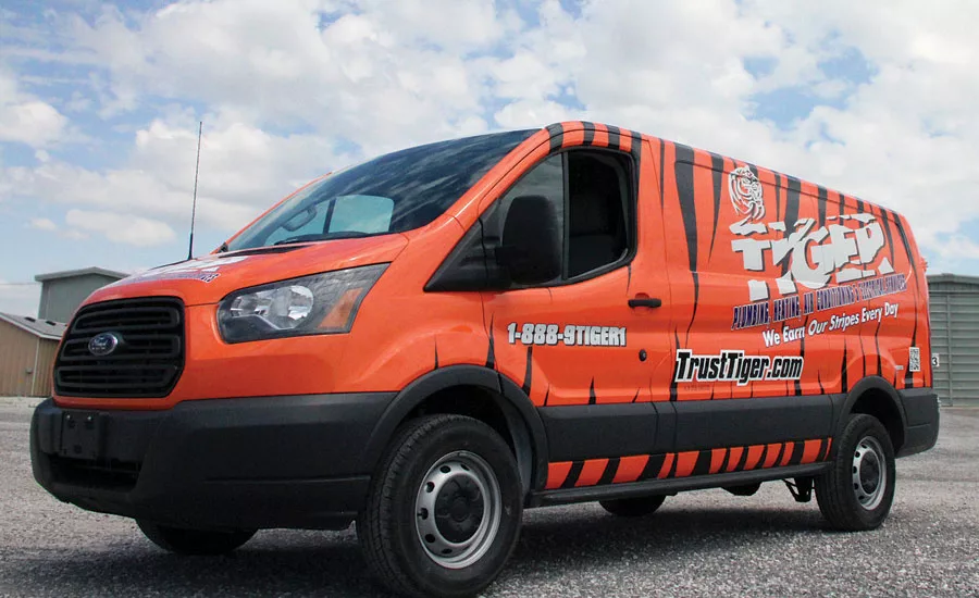
As April’s Truck of the Month winner, Tiger Plumbing’s truck shows a cohesive design with a name and branding that lends itself easily to the wrap design. Photo credit: Aggressive Graphics

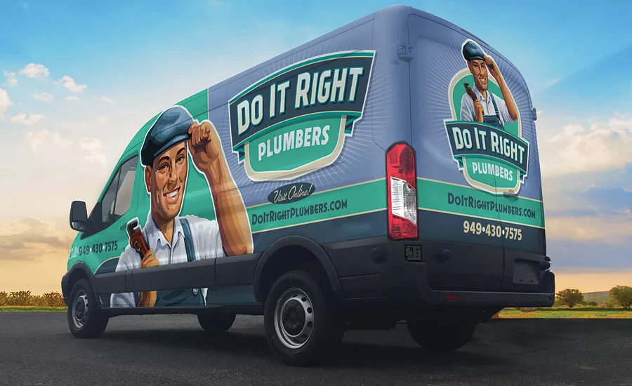
September’s winning truck showcases just how important colors can be. The entire concept of the brand was focused on appealing to women, including the use of teal, which was modeled after the original Tiffany Blue. Photo credit: Graphic D-Signs
Advertising a business can take many forms, from door hangers to highway billboards. Multiple studies have measured the impact of advertising, and 96% of RYP & Becker Group respondents commented that vehicle advertising, is the most impactful form of outdoor advertising. The strength of vehicle wraps has not gone unnoticed:
-
ARD Ventures, a venture capital firm, has studied the phenomenon of wrapped vehicles and estimates that a single vehicle’s advertising message is viewed by motorists and pedestrians as many as 70,000 times per day.
-
Outdoor Advertising Magazine states that outdoor mobile media billboards have a 97% recall rate, and 99% of survey respondents think mobile advertising is more effective than traditional outdoor advertising.
-
3M and the American Trucking Association noted 91% of the target audience notices the text and graphics on truck advertising, and the Traffic Audit Bureau notes that on local routes, monthly impressions range from 1 to 4 million hits.
-
The Ad Agency RYP & Becker Group completed the 3M Mobile Media Advertising Case Study in 2011 with the following findings: 97% of survey respondents recalled the ad, 98% thought the advertising created a positive image of the advertiser, and 96% believed fleet graphics had greater impact than billboards.
“Wrapping fleet vehicles is an image enhancer,” said Jaclyn Rebel, marketing director at SignZoo in Sarasota, Florida. “Whether you have brand-new trucks or older vans that have seen better days, professional, vibrant graphics offer an instant makeover that customers — and potential customers — register as ‘new and shiny.’ Even three vehicles can seem like 50 when running continuously through your service area. Many times, it’s that impression that triggers them to remember your company when in need of your services.”
Aside from giving details about the services they provide and contact information, a wrap gives clients and potential clients a feel for the plumbing company.
“The vehicle wrap can reveal a lot to a client,” said Cora Blue, writer/marketing and sales executive at Capital Wraps in Washington, District of Columbia. “Do they cater to mothers with clogged drains, or do they focus more on commercial jobs? Do they give the impression of being caring, on time, and tidy, or do they want to project an image of focusing on bigger projects with more complex plumbing issues? A wrap can deliver a message about core values of a company, which is a bigger marketing tool than many people realize.”
A wrapped truck instills trust in clients. It is the first thing they see when a contractor pulls up to the home.
“With a properly designed wrap, customers who see your truck or trucks in your working area get a sense of comfort and trustworthiness,” said Brian Steele, design consultant at Aggressive Graphics in St. Jacob, Illinois. “While adverting in your area, your company also gets an upstanding reputation of being a stronghold business.”
Philip Danza, president of G Dezine Wraps in Deer Park, New York, agreed: “The client will get an instant sense of ‘this guy knows what he is doing’ when you arrive at the home. This puts the client at ease and makes it easier for you to sell your services without the haggle. When you roll up to Mrs. Jones’ house with a dirty van and a magnet set on the doors with your logo on it, the client will ask herself, ‘Does this guy know what he is doing?’ Plus, she will feel like she can haggle with you because she assumes you need the work. You wouldn’t have your techs go into someone’s home in a dirty, ripped uniform, so why would you ever have them pull up to someone’s house in a dirty vehicle?”
Other benefits include paint protection (in the case of leased vehicles) as well as a less expensive removal of the branding when the vehicle is retired or sold. A wrapped truck could also be involved in other marketing and promotions plans, such as truck-spotting contests on social media.
Dos and Don’ts
An eye-catching, memorable design is critical for the vehicle to stand out. However, that doesn’t mean it has to be busy. Use professional vehicle artists to ensure you’re avoiding placement pitfalls and taking advantage of your vehicle’s compound services.
“Consider the vehicle; you may not need a full wrap to effectively convey your message,” Rebel said. “Make your contact information readily visible — large phone numbers and websites make it easy for potential customers to see and remember. Often, 75% to 80% coverage can deliver the same results. You can use signature colors and a short, effective message or tagline to optimize your wrap investment.”
"Make each side different to really stand out," said Jason Damron, Graphic Artist/Sales Engineer at Visual Marking Systems in Twinsburg, Ohio. "Consider where most people will see your truck before you start the design process. For example, will the vehicle be mainly parked in a customer’s driveway or on the job site; are you driving in the city or on the highway? The amount of information to include is determined by how much time your prospects will have to view it."
A wrap should compel a client to take action for your services.
“I don’t care how nice the design is, what materials were used, and how good the install is,” Danza said. “If people don’t notice it, the wrap is a failure. Also, make sure the design is appropriate for your business. If you are a high-end plumbing contractor working in million-dollar homes, you don’t want to roll up to that house with a cartoonish design, and vice versa.”
Don’t try to say everything on the wrap. Less is more, especially when people have 10-15 seconds to register and remember the vehicle.
“Black, white, and muted colors tend to get passed over more quickly by fellow motorists,” Rebel said. “Logos, symbols, and characters also make more of an impact than photographic images. Stay away from ‘normal’ in order to stand out.”
Color is another important aspect of a vehicle’s design.
“Own your color,” Steele said. “This is one of the most impressionable parts of the design. Another design element to keep in mind is ‘reflective.’ There are few companies that choose a reflective wrap, and it really makes it pop in low light and nighttime.”
Contrast is just as important as color.
“Make sure your logos and lettering contrast with background colors or graphics,” Danza said. “You don’t want to put dark blue lettering and information one shade blue lighter. It will blend in and be unreadable at 60 mph on the road. If you want dark blue lettering, put it on a sky blue background to make it pop.”
Current trends and clichés such as plungers and wrenches should be approached with caution and awareness.
“We don’t like to see anything overly trendy in the branding because it can quickly date the vehicles,” Rebel said. “It makes the company seem small when compared with sleeker, more professionally represented companies. A clean, classic look is most effective.”
Another cliché to avoid is photos of owners on trucks.
“You’re building a brand around an owner, which in theory might be acceptable, but when the owner dies or the company changes owners, you have some branding issues at that stage,” said Dan Antonelli, president and chief creative officer of Graphic D-Signs in Washington, New Jersey. “We never recommend photos of any type, especially of equipment, homes, and things like that. Photos aren’t representations of brand and go stale quickly. It’s also very important to be careful of trademark infringement.”
Religion and politics are also topics to avoid.
“I would avoid a wrap with anything overtly political,” Blue said. “Patriotic is fine; anything more is going to limit your customer base. In general, I also would stay away from anything overtly religious. Unless the business owner is reflecting a core value and wanting to attract a specific group of clients, keep religion to a minimum.”
It is important to stay true to brand.
“Don’t manipulate your logo to fit the vehicle,” Steele said. “Keep branding intact and design around it. Also, do not add colors to a design that stray from your branding just because you think it creates attention. It can take away from the overall look and cause confusion for your potential consumer.”
Blue agreed: “Be consistent with your branding. The wrap should match company colors, letterhead, business cards, uniforms, etc. Also, be mindful of how you want people to feel when they see the wrap. Ask yourself: ‘Does the wrap convey professionalism, confidence, and a trustworthy company?’”
Installation is just as important as the wrap, if not more so. A poorly installed wrap no matter how good the design, will reflect poorly on the company. "Always ask if your installer is PDAA Certified," Damron noted.
Coverage
The benefit of a full-coverage wrap is that it offers the most real estate to get your message across. Studies have shown what makes a memorable impression, and employing signature colors and visuals are among the most important factors.
“Full-coverage wraps help display the message in a professional manner where the vehicle looks complete and was designed to be like that,” Steele said. “Another important detail is material quality. There are several material options, some having a longer life expectancy than others. Be an advised consumer.”
However, a drawback to a full wrap is that it is the most costly — although it is still more affordable than paint. Sometimes, with great design, the truck owner can achieve the same impactful impression with a smaller investment, and with less maintenance/repair exposure (in the event of a wreck).
“With a minimal, simple design, there are no drawbacks,” Antonelli said. “They’re the hallmarks of building a great image. But remember, the most effective truck wraps are successful not only because they keep things simple, clean, and easy to digest from a distance, but also because of the branding. Many businesses wonder why they can’t achieve a great truck wrap design. In many instances, it’s largely because their current brand dooms their chances of a successful truck wrap design. Brand on trucks have very specific characteristics in order to make them effective. It’s much different than print or web applications because distance legibility is the primary concern.”
Rebel agreed: “In the case of a minimal, simple, clean design, there are only benefits. There’s a place for the wealth of information you have for your customers, but it’s not on your truck. Remember, most of the time, people are driving when they encounter your vehicle. A good rule of thumb is to consider how much information they could learn in 15 seconds. Most often, that’s your company’s name, what main service(s) you offer, and your contact information.”
Damron added: "I often suggest my customers use variable data for certain information within their full wrap design, which allows them to change or add information to the wrap anytime. New promotions, specials, services, the phone number or web address can easily be removed and changed for a fraction of the cost of designing it into the wrap itself. The upfront cost is a little higher, but it can really pay off down the road."
The vehicle represents the single most important visual representation of a business in the community in which it operates, Antonelli noted.
“It’s also perhaps the most important application of their brand,” he added. “What that truck communicates to the community is critical. It is always better to start that first conversation with a truck that exhibits a positive brand promise than a negative or neutral one. It’s not enough for people to say they’ve seen your trucks all over town. You could paint your trucks pink and purple, and people still would say they saw them all over town. The bigger question is: What does your truck say about your business?”
This article was originally titled “Look the part” in the November 2016 print edition of Plumbing & Mechanical.
Looking for a reprint of this article?
From high-res PDFs to custom plaques, order your copy today!


