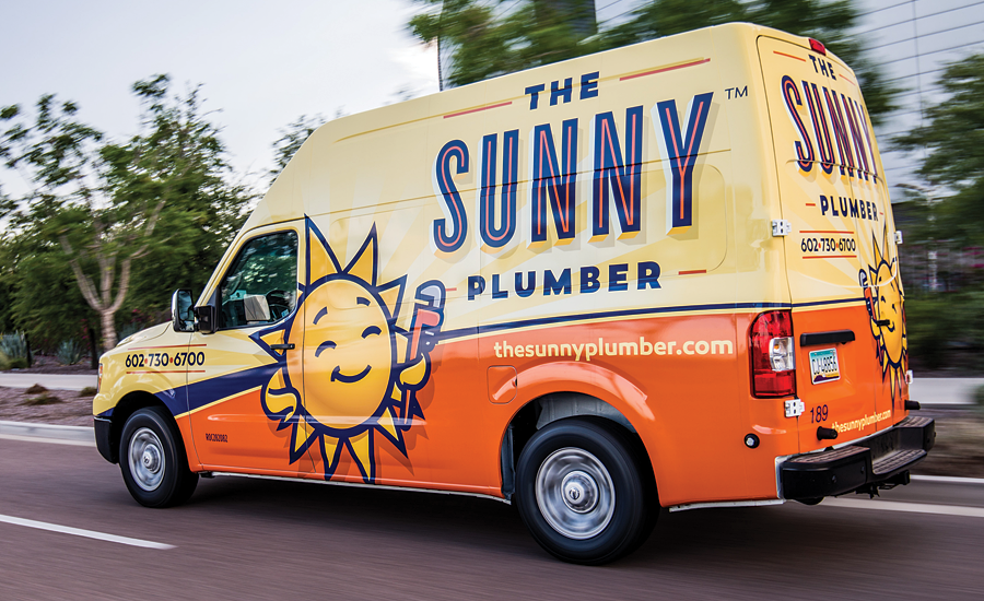
10 rules for truck wraps
The greatest advertising tool available to any plumbing company is the company’s fleet of vehicles.

The greatest advertising tool available to any plumbing company is the company’s fleet of vehicles. With vehicle wrapping technology, a wealth of possibilities is available to any company. Here are 10 rules to get the most from your wraps.
1. Any color but white. Sadly, most plumbers squander the opportunity to use their mobile billboards to build their brands by driving poorly identified white vans. Pick a base color other than white and not used by another area company with a large fleet. The entire color palette is available. Pick one. Pick a bright one.
2. Less is more. Just because wrapping technology gives you all kinds of new capabilities doesn’t mean you have to use them. Do not clutter your wrap. Do not use as many typefaces as you can. Follow the rules of good graphic design.
3. Focus on your logo. Nothing is more important than your company logo. It should command attention. Make it huge. Frame it, outline it or shadow it. Break the horizontal plane to command attention. We expect logos to be horizontal. When they are not, it evokes a primitive, instinctual need to notice anything out of the ordinary to see if there’s a need to fight or flight. Cantilever the logo 15%.
4. Contrast is good. Wraps with good contrast are more eye-catching. Contrast is not merely contrast of color. It also is large vs. small objects or shapes. It can be two completely different typefaces. When contrast works well, it draws the eye without consciously noticing the contrast.
5. Avoid clashing. While contrast is good, clashing is not. Some bright colors vibrate against each other, such as red and blue. If these are your colors, a simple way to maintain contrast without clashing is to use a white outline or border to separate the clashing colors.
6. Bold is better. Avoid thin scripts for a logo. Scripts are bad as a rule. They are hard to read, especially from a distance, and younger consumers who were never taught cursive cannot read them in the first place. Even if a block letter san serif typeface such as Arial or Helvetica is used, it should be bold, not thin. The letters also should be spaced far enough apart that they do not run into each other when viewed at an angle.
7. Use title case or sentence case. Except for a SHORT word, ALL UPPERCASE IS DIFFICULT FOR MOST PEOPLE TO READ. Why? Possibly because we read words by shape. It’s why most people can read Graham Rawlinson’s summary of his doctoral thesis at the University of Nottingham. Rawlinson writes, “It deosn’t mttaer in waht oredr the ltteers in a wrod are, the olny iprmoetnt tihng is taht the frist and lsat ltteer be at the rghit pclae.” Make it all caps and it makes the brain’s task more difficult. Use title case or sentence case on your wraps.
8. Use URLs and USPs. Next to your logo, the most important information on a wrap is your website URL and your unique selling proposition. If your URL involves multiple words such as serviceroundtable.com, make it easier to read and recall by capitalizing the first letter of each word (e.g., ServiceRoundtable.com) and by using a different color for adjoining words. De-emphasize your phone number unless it’s an alpha number (e.g., 1-800-GOT-JUNK). People can remember a website easier than a phone number.
9. The art of imagery. Since wraps present the ability to display full-color images, many plumbers add pictures of themselves, their kids or their products. Yawn. Use images that reinforce your brand, USP or that feature someone who looks like your average customer, minus 10 years and 20 pounds. Your customer is the person who calls and answers the door. Your customer is a woman.
10. Sell from behind. Break all the rules for the back of the truck. Use the back of the truck to sell to the driver stuck behind you at a traffic light — including an offer, call to action and phone number. The average traffic light stays red for 120 seconds, so your message should be readable in half that time in order to commit the name to memory.
For a free copy of the Matt Michel report, “15 Ways to Improve Your Mobile Marketing” and the “Truckvolution” case study of how a contractor used truck branding to dominate a market, call 877/262-3341 or visit www.serviceroundtable.com. You can reach Matt at matt.michel@serviceroundtable.org.
Looking for a reprint of this article?
From high-res PDFs to custom plaques, order your copy today!


